Dive In Espresso
Logo Design — Concept Project
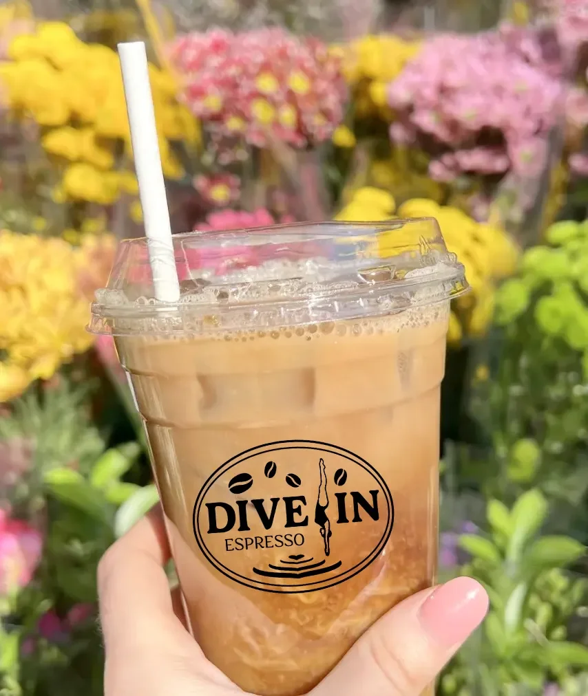
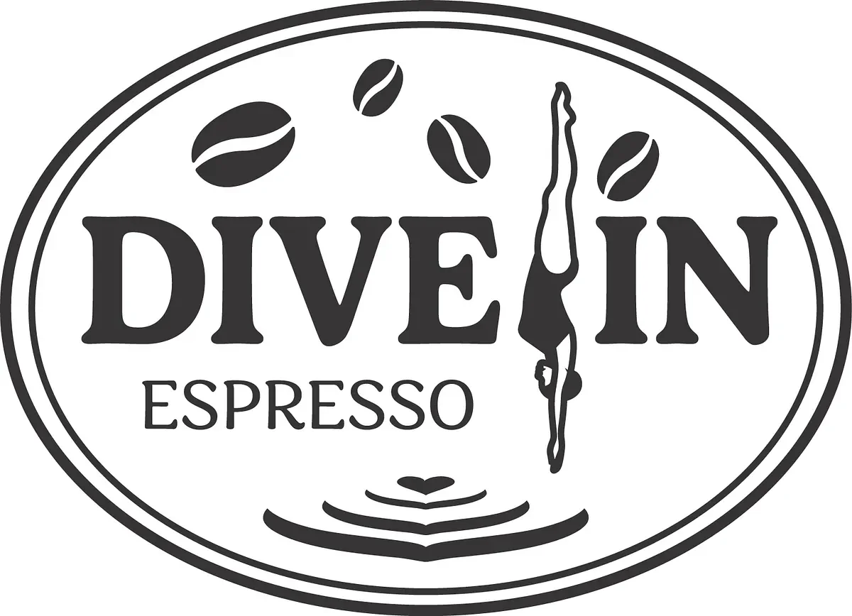
Dive In Espresso was a drive-through coffee concept proposed near an aquatic center. The brief was clear and constraint-driven: the logo needed to incorporate three non-negotiable elements — coffee beans, a diver, and latte art — without feeling cluttered or forced.
The result is a vintage-inspired oval badge mark that weaves all three elements into a single unified composition. Coffee beans arc across the top, a diver figure splits the wordmark mid-plunge, and ripple rings at the base evoke both a latte pour and a diver's entry into water. The mark works in both light and dark colorways and translates cleanly to small-scale applications like cup branding.
Scope: Logo Design · Badge Mark · Lockup Variations · Applied Branding